These past two months have allowed me to flex my creative muscles, especially when it comes to visual design. The bulk of my work still consists of creating graphics and designing pages for Semplice, but I’ve also been exploring some more personal projects and playing with new software (hi, Figma!).
This is a three-month series chronicling my internship with House of van Schneider. You can read about my first month here.
Now that I’m fully acclimated to working with the team and have a strong grasp on the different brand styles I work with, I’ve been refining my work process. That includes learning to think critically and have a smart approach to design.
Consistency is key
In my last blog post, I wrote about how design is all about communicating a message, and how keeping that message in the forefront of my mind helps me design better. The thing is, sometimes that message can have many layers. The difficult part is prioritizing what (and how) I want to communicate.
When I first started designing web pages, I thought as long as I checked off all the items on my list (nice layout, beautiful images, consistent typography and UI elements), the page was good to go. Sometimes I’d even finish a design, look at it and think, "Well, it’s not great, but it’s good enough and I don’t know how to make it better – I’m tapped out!" Luckily, my team is great at seeing where my weaknesses lie and always comes in clutch with just the right advice.
I’ve learned that I need to start thinking about my designs from a larger perspective. It’s important that each individual element (typography, graphics, images) looks beautiful, but it’s also important that these elements work well together – that they all live in the same world. There needs to be some type of consistency between elements in a design for everything to make sense on a micro and macro level. That means if I’m going to use sophisticated, elegant images in one part of my design, I can’t be using colorful, playful images in another part. All the images need to have a cohesive tone and feel for the overall design to work. Put simply, I learned about art direction and its role in design of all forms.
Nobody’s asking you to reinvent the wheel
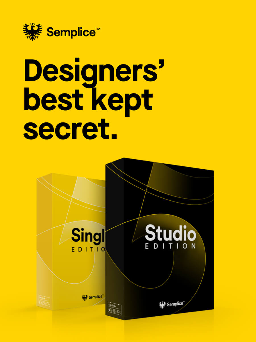
When I’m told to “be creative,” and “try something new,” my mind tends to translate that to “DESIGN SOMETHING CRAZY WE’VE NEVER SEEN BEFORE!” As you can imagine, the designs I churn out from that mentality usually aren’t great. I’m still learning and training myself on how to be more creative, and most of the time the process doesn’t include reinventing the wheel. It just means experimenting a bit more and getting inspired by other designs. Since I’ve been doing a lot of work for Semplice, that might mean taking a look at some other pages on the site and grabbing ideas from there to use in my designs.
This also applies to the UX and UI work I do. Take a look at the money management apps on your phone – don’t they all look kind of similar? Now take a look at your photo editing apps. These too look similar to one another. That’s because all these apps all utilize design patterns. After all, design patterns exist because they work. It’s okay to recycle ideas and re-use elements when designing. Often, creativity just means finding a different (sometimes new) interpretation of something else.
"Sometimes I’ll spend two hours working on a graphic and all I can come up with is something that looks like it could have been made in Microsoft Paint."
Don’t be ashamed of your work
This is for all the newbies and aspiring designers out there like me. Don’t be ashamed of your work. It’s OK (and even good) to fail because that means there’s room for improvement. Sometimes I’ll spend two hours working on a graphic and all I can come up with is something that looks like it could have been made in Microsoft Paint. So what do I do when I have to submit my graphic knowing I’m going to have to rework it? I’m honest about the thought process behind my design. I explain what I was trying to achieve, why I included what I did, what I think can be improved, and ask for feedback.
I’m lucky to work with the best team who recognizes my effort and always provides great feedback to help me and my designs become better. If it’s technical skills I need help with, they’ll give me tips or a little tutorial on how to do something in Illustrator or Photoshop. Other times they’ll give me some more creative direction if I’m lacking in that aspect. The point is, the more honest and communicative I am with my team, the more they can help me, and the better the end product turns out. It’s a win-win situation for everyone.
—
I’ve been working on some fun projects that I can’t wait to debut in a few weeks on my portfolio. Speaking of, my portfolio’s going to get a nice new look soon too. For the last few weeks of my internship, my focuses will be maximizing the time I have with my team and continuing to get inspired so I can implement new ideas into my designs.