Behind the scenes of the Westworld UI
Published
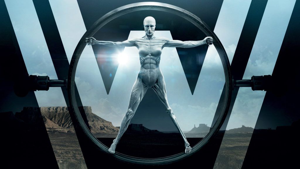
In late 2016 it happened. HBO released the TV series Westworld and invited us into the wonderful world of a technologically advanced amusement park, filled with android hosts ready to give us everything we’ve ever dreamed of.
As HBO unveiled episode after episode each Sunday, I was glued to my TV as millions of others did the same. Westworld went on to to rank as one of the most-watched first season series on HBO ever. No surprise, if you ask me.
But besides the show's stunning cinematography and title sequence, I became obsessed with its graphical details. Specifically the futuristic graphic user interface elements (GUI) you can find throughout its fictional world. As a designer of current products and interfaces, I draw a fair amount of inspiration from futuristic interfaces like these.
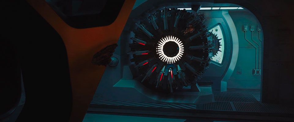
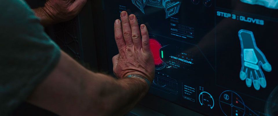
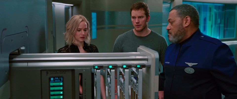
After digging a little deeper I found one of the designers, Chris Kieffer, who not only worked on Westworld, but other movies like Passengers, Interstellar, G.I. Joe and many others you’ve probably heard about.
Luckily Chris agreed to an interview, giving us the full tour on how it is to design user interfaces for TV and film.
Let’s go!
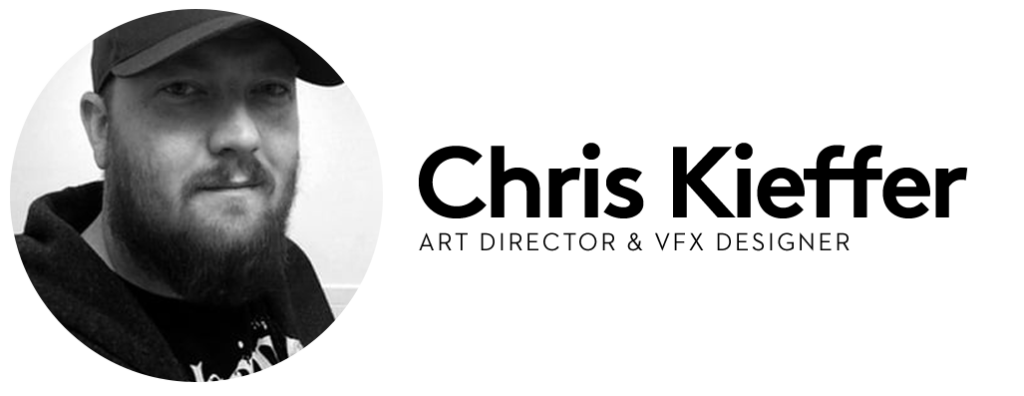
Tell us how you found yourself designing user interfaces for some of the most popular sci-fi films and shows out there. Did you picture yourself working in film when you first got into design?
I’ve always wanted to work on films. I didn't plan on doing UI’s for films, though I have always been fascinated by them. I used to see UI’s when I would go to the movies and always wonder how those "computers" did that. I would try remaking some of the ones that I really liked. I didn't think that would help me later on when I started to actually work for movies, but it did.
The opportunity to work on Westworld, Passengers and Interstellar were all somewhat connected. I had worked with crew from all three on previous projects. Sometimes it’s the producer, director, production designer, art director or props. It makes it easier to get on a specific film when you have those connections.
What’s your background?
My background is a mix of a lot of things. I started out in print design, working at a t-shirt shop while I was in high school. I didn't do any computer design at the time. The shop was old school, which I liked. A lot of other places used Corel Draw and Quark for screen printing designs, which I didn't know. At this place I would actually draw every shirt design, then photograph it and make the transparencies, then with a blade hand-cut the amber for all the color separations. It was very detailed work and made me appreciate fonts, because I had to do them all by hand.
While in college I went from shop to shop doing shirt designs, and I was getting a lot more into Photoshop and Illustrator. I studied graphic design and visual communications, and realized I loved the fact that I could take all my designs and bring them to life with animation.
“I took a chance and I have been here since.”
After college I started working at a company doing a lot of print and packaging work, all the while doing motion graphics work on the side. I had moved up to managing the art department when I got a call to go to another company. I went in for an interview and it went well. On the way home I got a call from Warner Bros. to work on a film. Right after that, the company that just interviewed me said I could have the job if I started immediately. The Warner Bros. job was only a guarantee of one week of employment on a film, that’s it. I had to make a decision: take the new "guaranteed" job which paid a lot more than my previous job, or take the one week at Warner Bros. working on a feature film and hope for more. I took the one week — I couldn’t pass up the opportunity to actually work on a movie! I took a chance and I have been here since, going on 11 years now.
What's the process like working on interfaces for movies or films? How many people do you work with to complete an interface from concept to visual design to animation?
Every project is different, but I’ll give you a somewhat normal setup. Early on in the project, we get a call to come in and meet with production and discuss what they need, break down the script, develop a budget, etc.
Once all those things are done and set up, we start the design process. Preferably we would start early in production and have time to really get into the design and mechanics of everything, but that rarely ever happens. Honestly, it’s usually around 2-3 weeks before we start shooting. So first we would start designing the UI's look, style, color palette, functionality, etc. in those first few days.
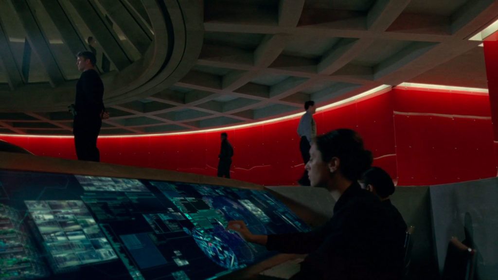
Then we usually have a meeting to go over everything with the director, production designer and art director. Based on that meeting we continue to refine and make whatever changes are needed. We also discuss the hero elements that will need to happen. Hero is a term we use to describe something in a script that is specific to the story and called out to happen on a screen, hologram, monitor, etc. This is something specific that will have to be ready and worked out to be shot in camera.
Then we usually start breaking down the graphics in different sections. Usually myself and a few others will continue designing and animating graphics, some on hero and others building background screens or elements. Others will be programming how we will actually make it work and interact on set, while also prepping the gear and necessary equipment.
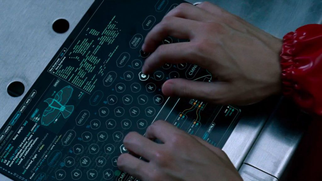
Then a few more meetings until we start to shoot. By then we have a pretty decent library of graphical UI elements for that film. While we are shooting a particular set we are working on the next set and the graphics for it, along with making changes on the fly if needed. This goes on until we finish shooting and finally wrap.
In post production we would normally do the graphics we couldn't shoot on set and knew would be replaced in post. That wasn't the case on Passengers, for example. On that project we came up with some concepts for post, but it was all handed off to MPC [Moving Picture Company] I believe. That’s pretty common too. I may work on a project in post that someone else did all the onset playback graphics for, and vice versa.
“The actor or actress just made random gestures on a tablet or hologram; now I have to reverse engineer how the UI could work based on those movements.”
Tell us a little more about the post process. I'd assume seeing the UI in context, mapped to its proper surface, changes quite a lot for you.
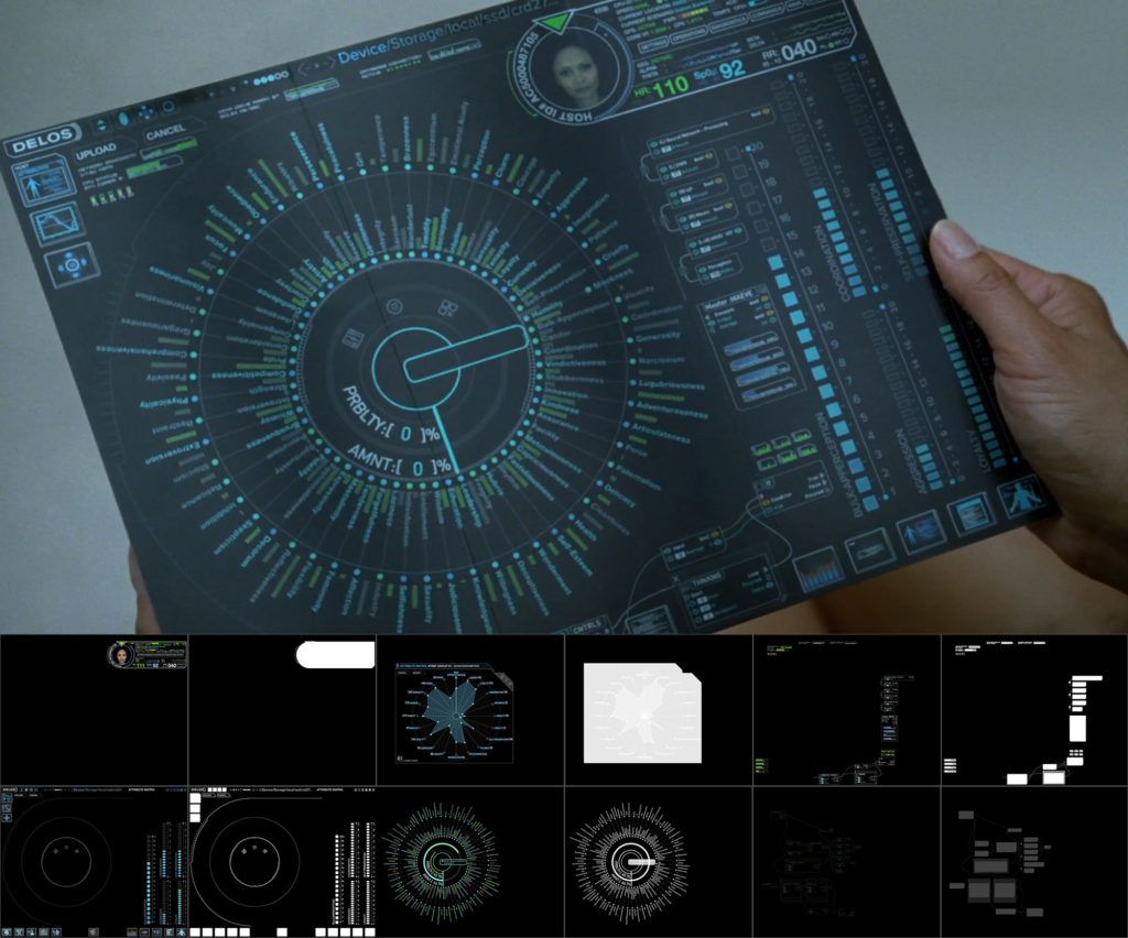
Sometimes we can't pre-build a working graphic for something because it will strictly have to be done later in VFX. For example, the tri-fold tablets in Westworld were always going to be done in post. We tried a few options for some of the background ones that would be live in camera for interactive lighting, using tablets roughly the same size or EL Paper on the tri-folded tablets.
What made it a lot easier is pre-designing what they were going to look like and how they were going to function before we shot them. So on the day of shooting, I would go over how the UI works on the tablet with the actor before the scene and sometimes during. That made it much easier in post to match their movements and make the UI have some consistency.
Too often I get called into VFX to create an FUI (fantasy user interface) for something that has already been shot and cut together. The actor or actress just made random gestures on a tablet or hologram; now I have to reverse engineer how the UI could work based on those movements and gestures.
How is it different working on futuristic interfaces vs. real life products? For example, do you try to approach a UI for Westworld as realistically as you can? How real does it have to be?
I have worked on many different styles of UI's, everything from old CRT vector graphics to futuristic ones. They all have their own level of difficulties. Some films need the technology to look as if it was real in that time. Like making a bunch of older screens from the ‘70s - ‘80s to match what they actually looked like back then. Some need to look like they're from that time, but it’s a pseudo reality so it has to conform to that as well. There are some scenarios where they want it set in a distant, but not too far future. So we would design what we think it could be and what technology could be like for that specific film or show.
“There have been times when something is just thrown in as filler in a rush, but it could haunt you after that.”
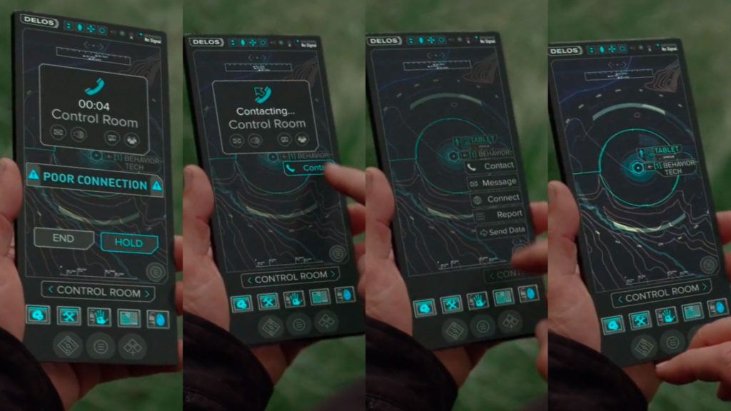
When I look at the mobile UI from Westworld, I see a lot of icons that are currently not being used. When you design an interface like this, do you imagine a purpose for every icon as you would for a product used in real life?
I try to make every button or icon have a purpose. There have been times when something is just thrown in as filler when in a rush on set before a take and they want a change, but it could haunt you after that. That might have just established a main part of the UI and has to be figured out from now on. In the particular shot you’re referencing, the icons do have general meaning. From left to right they could be:
- Device Settings
- Tools/Utilities
- Security
- Host Database/Logs
- Admin controls for Stubbs character
Now those have never been established as that, but they could be.
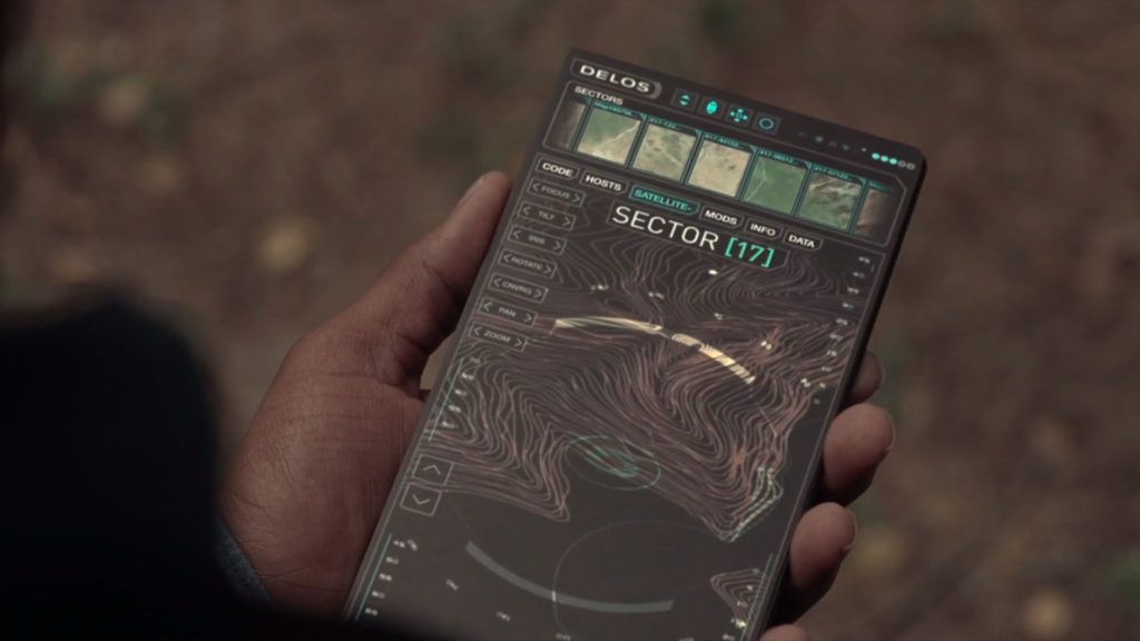
How important is it for you to think through the whole product instead of just designing key screens?
Depends on the project. Sometimes we may be making background screens to fill a set. They will never be shot up close and don't have to be completely thought through like a hero screen. Though they do have to be designed and created for the specific world of that project. So the UI would be consistent, but the little details or elements within the UI don’t have to tell a specific detail of the story. They set the tone. Like if it was a military base or command center, the graphics would all be created for that specific military base. The maps and other parts would be locations or events from the script, but not at the detailed, scripted hero level.
“Sometimes you only have a second or two to tell a story, so that people watching can instantly understand what they are seeing.”
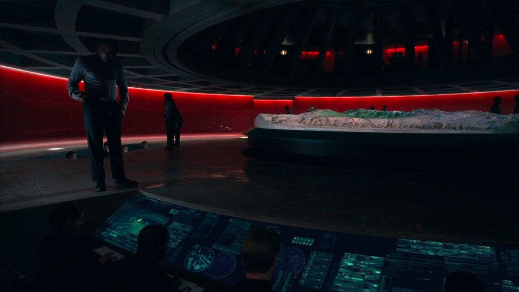
When I look at some of the interfaces you design, they follow the actual dialog and story of the episode very closely. What’s the process for designing a screen like this? Do you get the script or some wireframes explaining what you need to do?
Yes, I have to go through the script and break down every shot or set that has graphics in it. Sometimes it’s vague and says something like, "She is looking through medical documents about a patient." The director will say it doesn't have to be a specific disease, just about the patient’s medical history. In this case the design is supporting the story versus telling a specific part of it. Then there are times when the script is very specific and says beat by beat what we see on the screen, so the design has to match exactly. In that case I would have to design around this while telling the story. Sometimes you only have a second or two to tell a story, so that people watching can instantly understand what they are seeing.
“I think the expectations of UI are climbing way past what we saw in a movie and thought we could never have. Now we see it at our fingertips.”
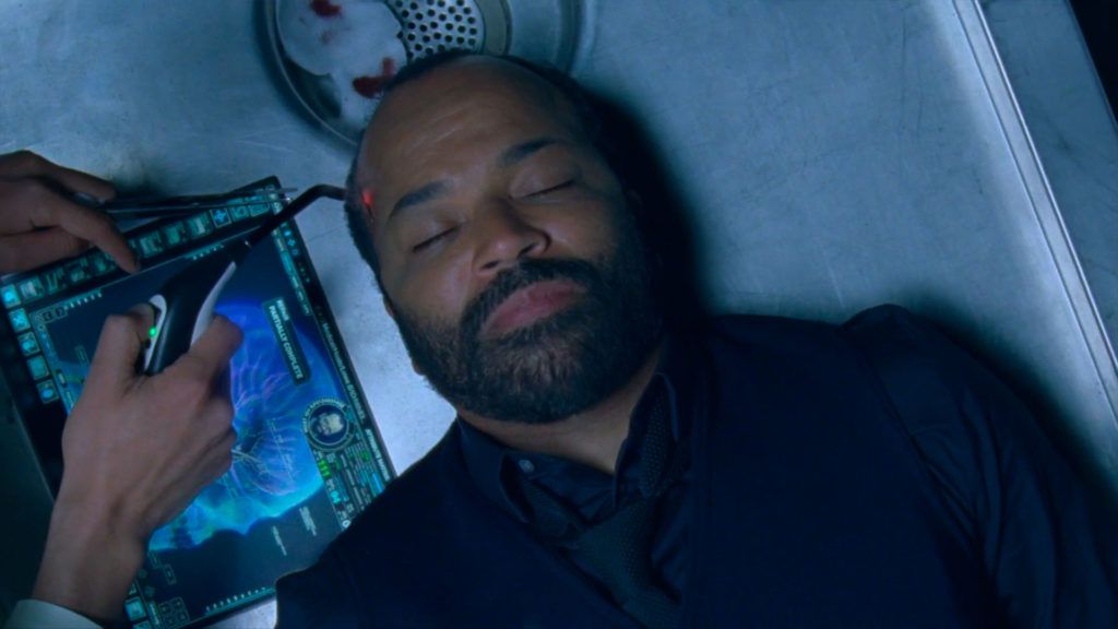
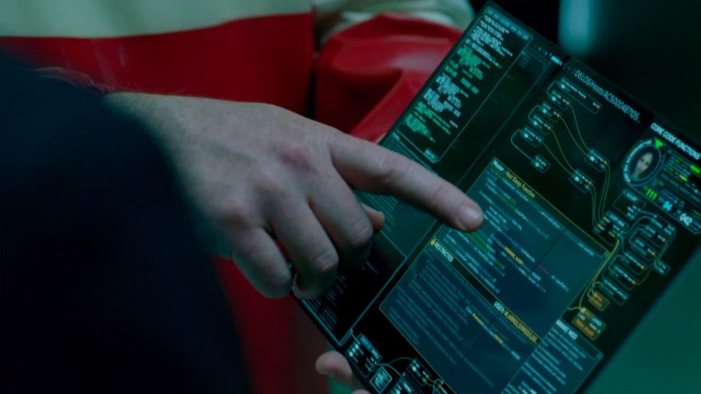
Where do you see real life UI design going in the future? Do you ever consider that the things you do might inspire other designers working on real, current products?
I’m not sure, to be honest. I can say that people are understanding the importance of a well-designed UI now more than ever. I think the expectations of UI are climbing way past what we saw in a movie and thought we could never have. Now we see it at our fingertips. I talk a lot with people who are making real world products or software who see things in a movie and want to make it in real life. They are inspired by what they see in a movie and want to make it a reality. On the other side, I am very inspired by real world tech. Sometimes I find that when I’m designing something I think would be cool to have in a film, it already exists in reality and it’s even better than I expected. That inspires me to make something completely new.
What would be one of your dream projects in the future? I know that's a hard one to answer right after you did Westworld.
Because I'm a big fan, I have always wanted to work on a Star Wars film. That’s one I would really like to be a part of.
What advice would you give to someone who might be interested in doing what you do? What are the key skills of a futuristic UI designer?
It depends on what part of this work they are interested in. There are programmers who develop the software we use to play back the graphics on set. There are designers or animators, sometimes people who do both. I wish I could do all three — design, animate and program. But I can't program on that level so I will leave it to the professionals. I focus mainly on design and animation, but understanding how it will be programmed really helps the workflow. As a designer or animator you can also work in post with VFX to create FUIs that are burned in or replaced.
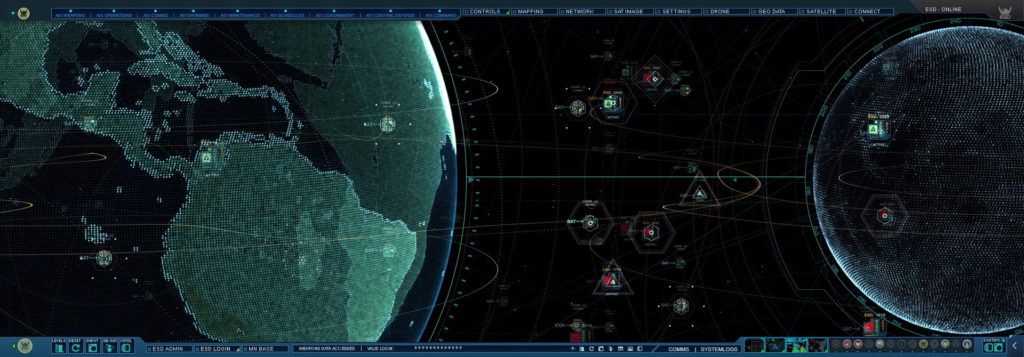
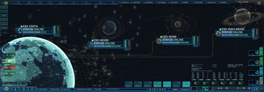
I think having a good sense of design and animation is key. Knowing how something will move in space and understanding how to use motion along with your designs is a great skill to have. I would also recommend what I did. If you see something that inspires you, try to remake it. Try to solve how something was made and find a new, or even better way to approach it. Even if you can’t recreate it, you have learned something new. Then start designing and making your own. Even if it’s not for a specific project, come up with one.
Also don’t be afraid to ask other designers questions. Some may not respond and some may help. I try to help anyone who is passionate about this kind of work as much as I can.
__
Chris, thank you so, so much for this interview! You might have guessed from my sometimes stupid questions how little I know about designing UI for the film industry, so I personally learned a ton.
For everyone who wants to learn more about Chris’s work you can find his portfolio right here, and make sure to follow him on Twitter as well.
Read more
© 2021 House of van Schneider LLC
All rights reserved.
MORE ABOUT TVS
About DESK
Curated mixtapes
DESK partnerships
BECOME A FRIEND
Twitter
Dribbble
Instagram
We're sorry, our pandas couldn't find any articles
Why don't you take a look at popular topics like
Design, Productivity or Self-Improvement?

